Friday, 12 October 2012

"THE GREAT FACE RACE"

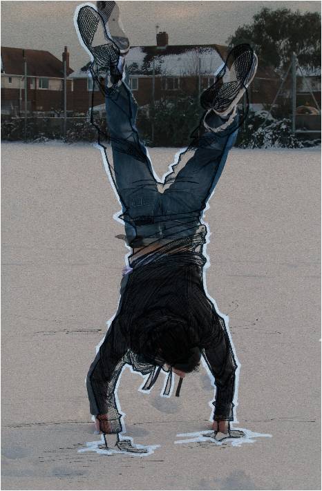
A small project from Uni a week ago. Take a massive A0 portrait of yourself and draw on it by hand stuff personal to you that connects the audience with who you are.
Handdrawn first; digital version last (completed in Photoshop).


I used one of my own works in the digital version ("HAMSA") to just sort of cover the background.

(Beware the Bears)

Thursday, 11 October 2012

MOSCOW: REVISITED

Not literally.
Playing about in Photoshop waiting for my lecturer to arrive and remembered I had an old sketch of Russia I never did anything with. Did a couple of variants (text and halftone edges) but overall a pretty good experiment to unwind with.

Watercolour paper and brown paper textures


Tuesday, 9 October 2012

GOAT

Goats and mountains. Ideal.

Brown paper on sketchbook with Faber-Castell ink pen (XS, S, F, M & B)


Monday, 8 October 2012

EDITORIAL ILLUSTRATION PRACTICE

Today at University was all about editorial illustration and how to convey the message without words so it was a matter of context, content and form.
Given 5 phrases to depict; here are 2:

"Sky's the limit"


"Devil's in the detail"


Just simple Faber-Castell ink pen (XS & M) 

Sunday, 30 September 2012

QUO VADIS

Been thinking about old films a bit lately with the phrase "Quo Vadis?" said in a German accent.
Quick biro sketch of Nero (portrayed by Peter Ustinov) from the 1951 film.

Thursday, 27 September 2012

VISUAL EXPLORATION

Digital collage of news issues.

Had to produce a 200x200 Photoshop document, digital collage in response to a recent news story on BBC News using photographs relevant to the story.

Mucho, mucho masks and brushes went into this. And bevelling. Lots of bevelling.

Austerity protests in Greece and Spain.

Monday, 24 September 2012

Sunday, 29 July 2012

A FEW EXTRAS

 Photo overlays on brown paper sketch
Jay


Halftone brushes
Namor

GUTENBERG

Letterpress design. Would've done this in a serif or blackletter-gothic font at the time to reflect movable type, but didn't think to.

Friday, 27 July 2012

51°23’22. 39 N 30°05’56. 93 E

Sent off for my short graphic novel 51°23’22. 39 N 30°05’56. 93 E (Chernobyl 2065) to Blurb Books and it arrived today. Here's a preview of the unpacking.


Wednesday, 18 July 2012

IRONMAN POSTER

A couple of posters I've made using traditional media (handmade paper and Indian ink), Photoshop and Illustrator.


Thursday, 5 July 2012

VARIANT COVERS

Different front cover designs, top two inspired by The Losers.
Went a bit over board making some variant front cover designs this past week.


SHORT GRAPHIC NOVEL

Completely original concept. (2012) Pages in order starting with the front cover. Hours of drawing, inking, Photoshop and Illustrator. All totally worth it.


Tuesday, 26 June 2012

REVISITING

"Die Fraktion" Take 2.
I think I've halftoned this to death in 10 minutes.

Wednesday, 16 May 2012

TYPOGRAPHY

Typographic posters.

Anatomy of a double-storey "a" - Bowl
 Created by hand (drawn and inked), coloured in Photoshop, 
text and border in Illustrator


Anatomy of 5 letters set out as a comic page. "Rob's Typographic Emporium"
Created by hand (drawn and inked), coloured in Photoshop, text in Illustrator


Anatomy of serifs in type. Something different for me to try and it turned out pretty well
Created in Illustrator

Thursday, 10 May 2012

PANELS: WORK IN PROGRESS

Panel ink sketches for Graphics unit from referenced photographs.
Topic: Chernobyl 2065

Ferris wheel, Pripyat &  panoramic view of Pripyat

Damaged reactor, May 1986 

Thursday, 22 March 2012

RECREATION

A recreation I've done for a unit in Graphics. Superman: Red Son. The original is on the right.
Hand-drawn then coloured in Photoshop, text added in Illustrator.


Wednesday, 7 March 2012