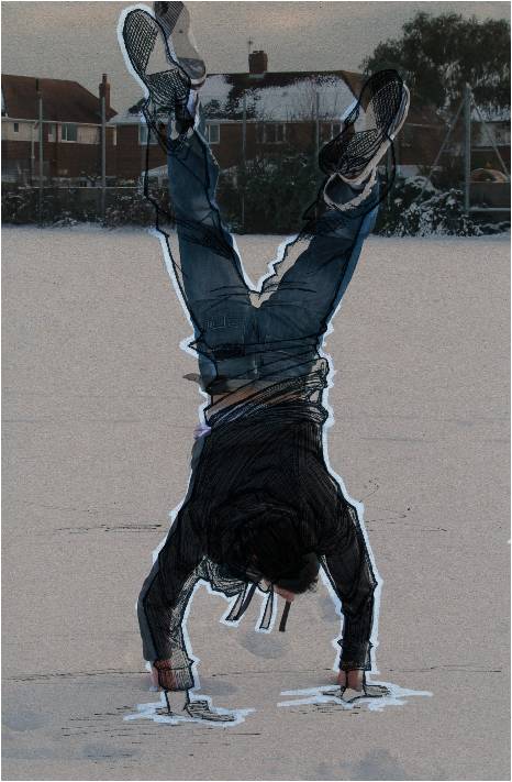
I am quite happy about the outcome of this portrait as I tried to layer the same colours of fibre-tipped colour pens to create shadows. I think that the style of blending the effect on the right has given the image deeper and richer colours. With the feathers I kept them lightly shaded with a black biro so that they didn't take away too much from the image.
Showing posts with label effects. Show all posts
Saturday, 19 January 2013
Thursday, 11 October 2012
MOSCOW: REVISITED
Not literally.
Playing about in Photoshop waiting for my lecturer to arrive and remembered I had an old sketch of Russia I never did anything with. Did a couple of variants (text and halftone edges) but overall a pretty good experiment to unwind with.
Watercolour paper and brown paper textures
Thursday, 27 September 2012
VISUAL EXPLORATION
Digital collage of news issues.
Had to produce a 200x200 Photoshop document, digital collage in response to a recent news story on BBC News using photographs relevant to the story.
Mucho, mucho masks and brushes went into this. And bevelling. Lots of bevelling.
Had to produce a 200x200 Photoshop document, digital collage in response to a recent news story on BBC News using photographs relevant to the story.
Mucho, mucho masks and brushes went into this. And bevelling. Lots of bevelling.
Austerity protests in Greece and Spain.
Sunday, 29 July 2012
GUTENBERG
Letterpress design. Would've done this in a serif or blackletter-gothic font at the time to reflect movable type, but didn't think to.
Wednesday, 16 May 2012
TYPOGRAPHY
Typographic posters.
Anatomy of a double-storey "a" - Bowl
Created by hand (drawn and inked), coloured in Photoshop,
text and border in Illustrator
Anatomy of 5 letters set out as a comic page. "Rob's Typographic Emporium"
Created by hand (drawn and inked), coloured in Photoshop, text in Illustrator
Anatomy of serifs in type. Something different for me to try and it turned out pretty well
Created in Illustrator
Tuesday, 21 February 2012
Saturday, 11 February 2012
AND NOW FOR SOMETHING COMPLETELY DIGITAL
Tutorials.
One of my favourite effects in Adobe Photoshop at the moment: letterpress. A little play on the Clooney/Nespresso adverts.

Subscribe to:
Posts (Atom)